HEX #252622
R 37 G 38 B 34
Brand Identity · 2019
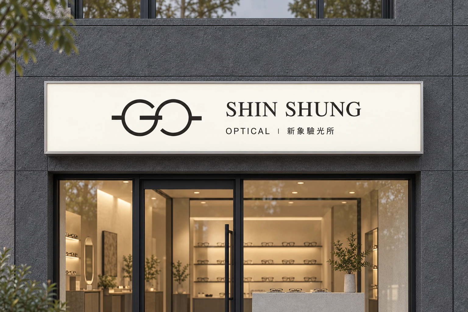
An optical identity built around two connected forms. The open frame suggests a way of seeing; a restrained wordmark and quiet colour palette carry it from portraiture to everyday objects.
01 / Identity
02 / Symbol structure
Distinct openings and curves meet at the centre.
Short bars enter the contours and extend the horizontal rhythm.
03 / 13 · SYMBOL STRUCTURE
FOCUS / 01
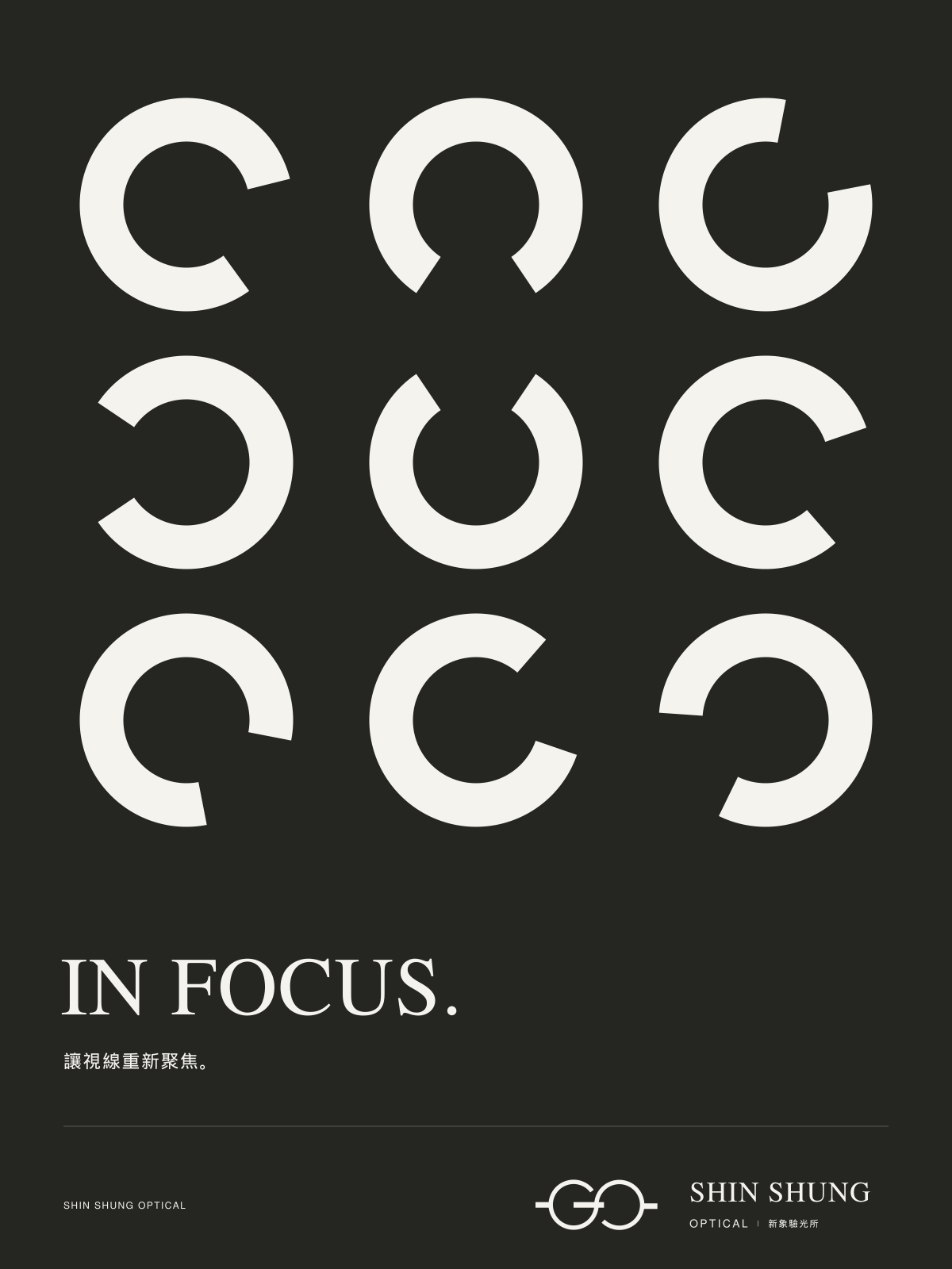
05 / 13 · MOTION IDENTITY
03 / Colour system
HEX #252622
R 37 G 38 B 34
HEX #4C5155
R 76 G 81 B 85
HEX #33463D
R 51 G 70 B 61
HEX #F5F3ED
R 245 G 243 B 237
06 / 13 · COLOUR RECORD
04 / Image direction


05 / Everyday objects
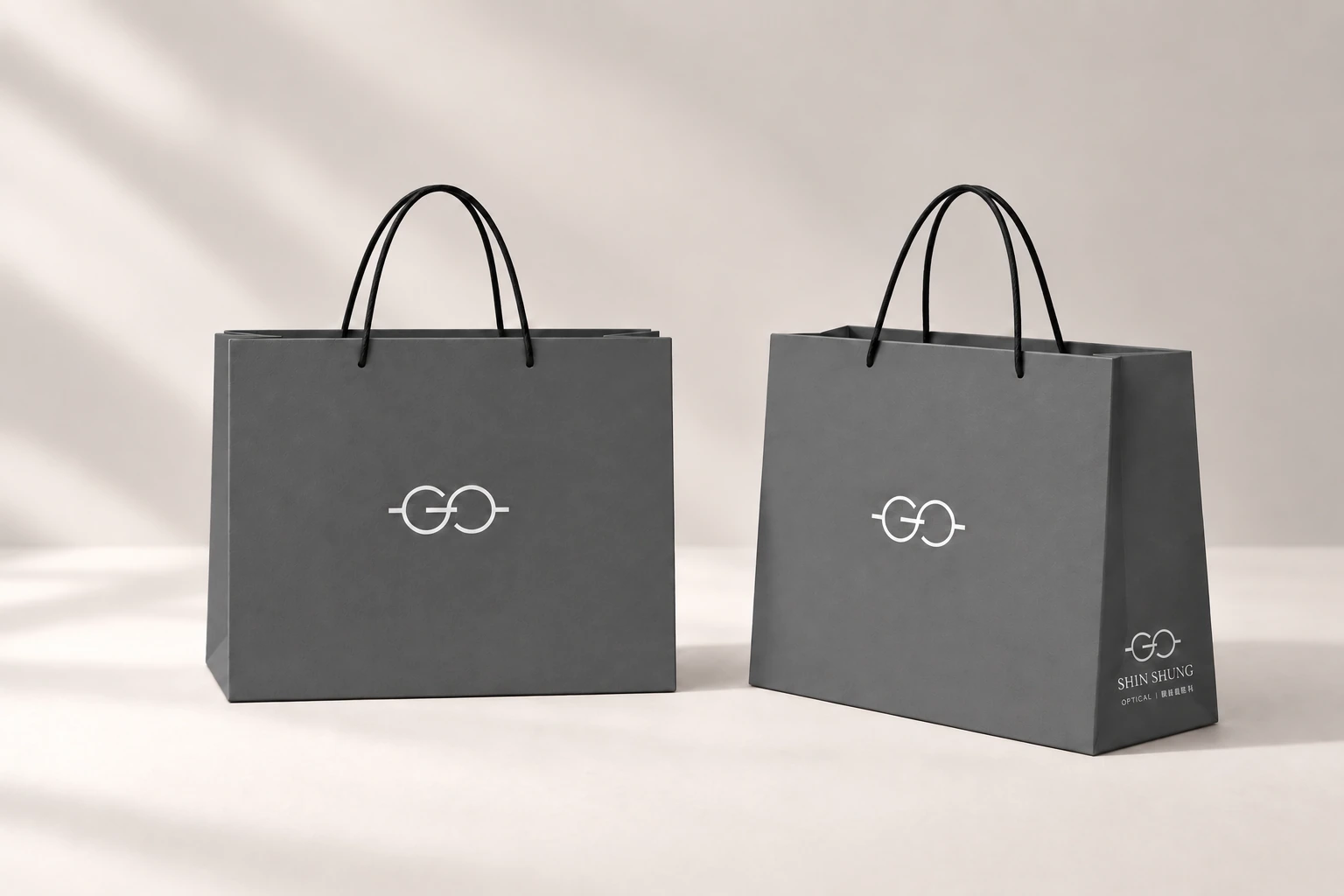
A compact carrier with the symbol on the front and the full signature on the side.
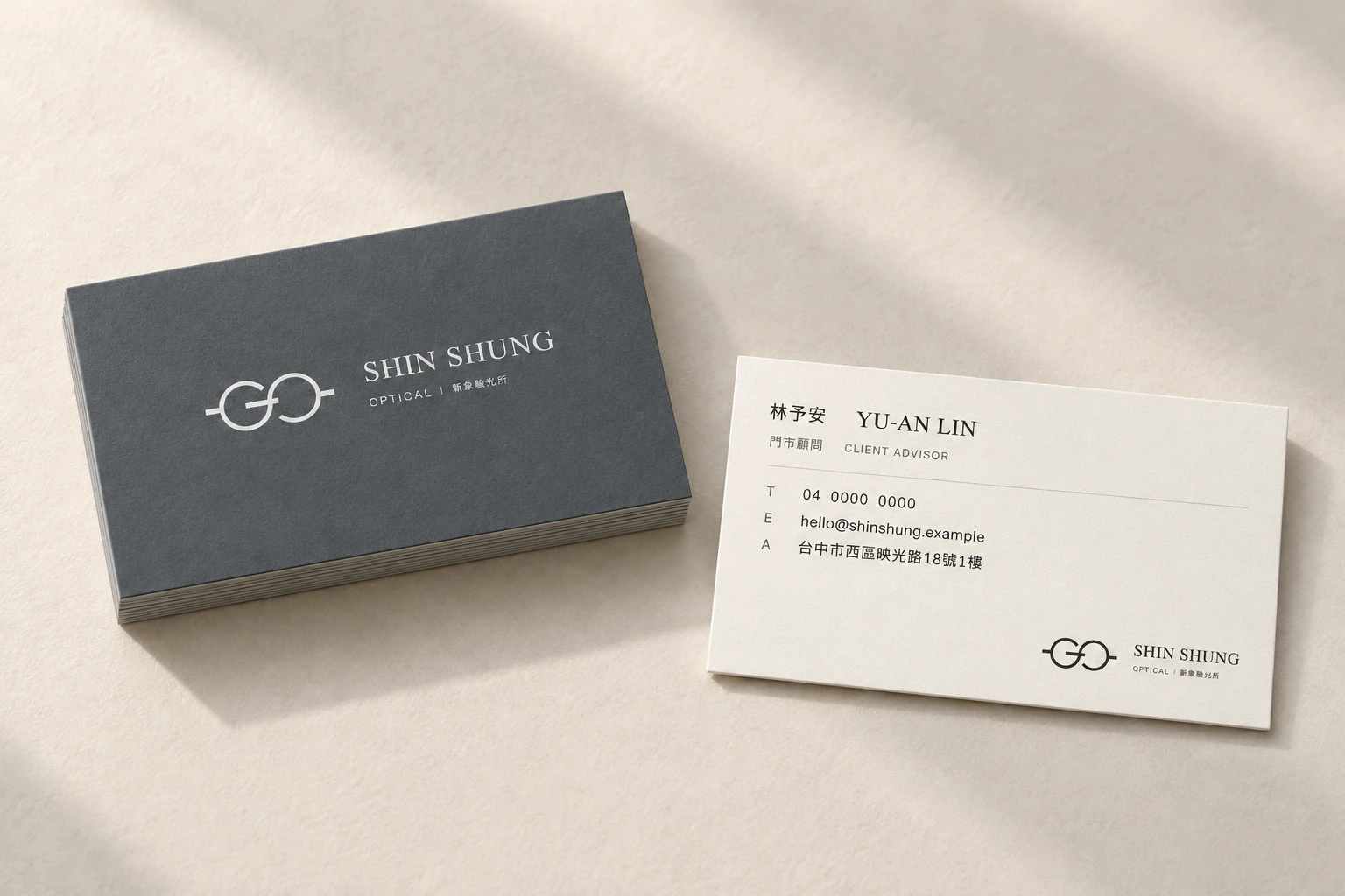
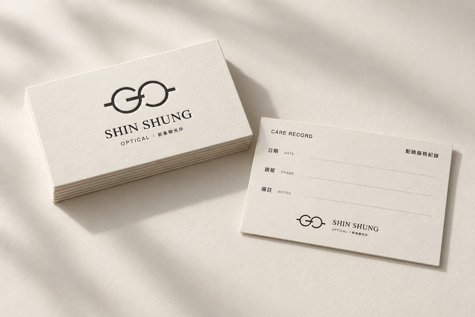
Business and care-record cards share a paper palette, with room for the information each needs.
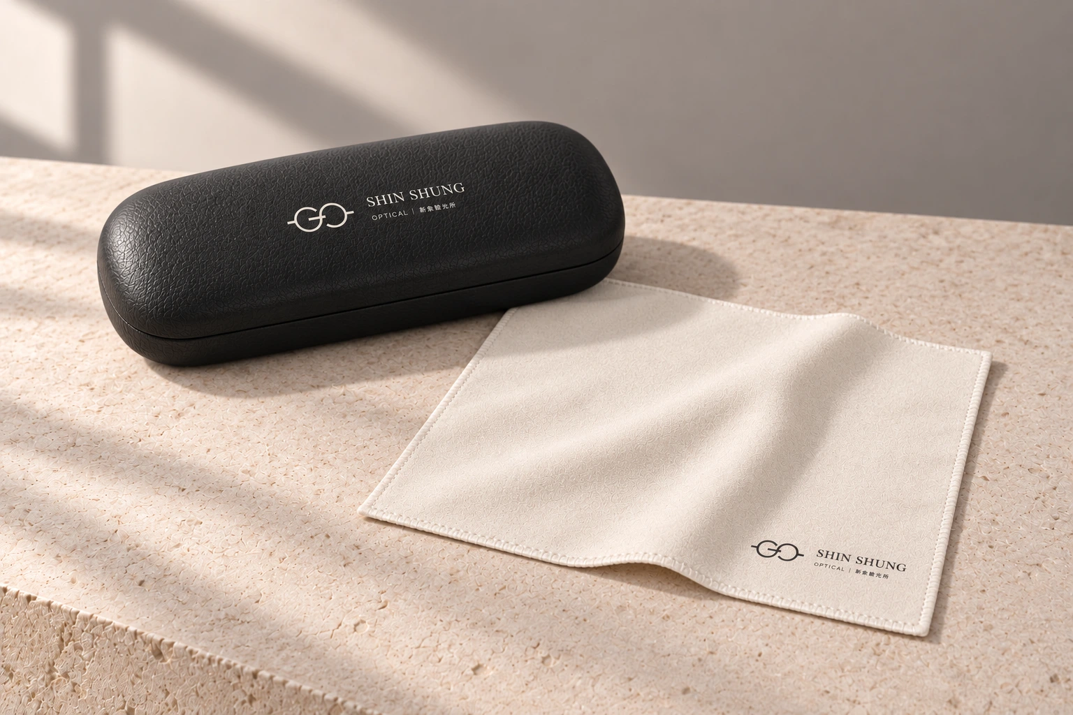
A charcoal case and warm-white cloth bring the identity into an everyday ritual.