The O becomes an upright, rounded solid, contrasting with the open strokes of the surrounding letters.
EDISON FANG WORKSHOP2024
Brand Identity · 2024
Your Fruit
Liner notes
Graphic Freshness.
Brand Identity
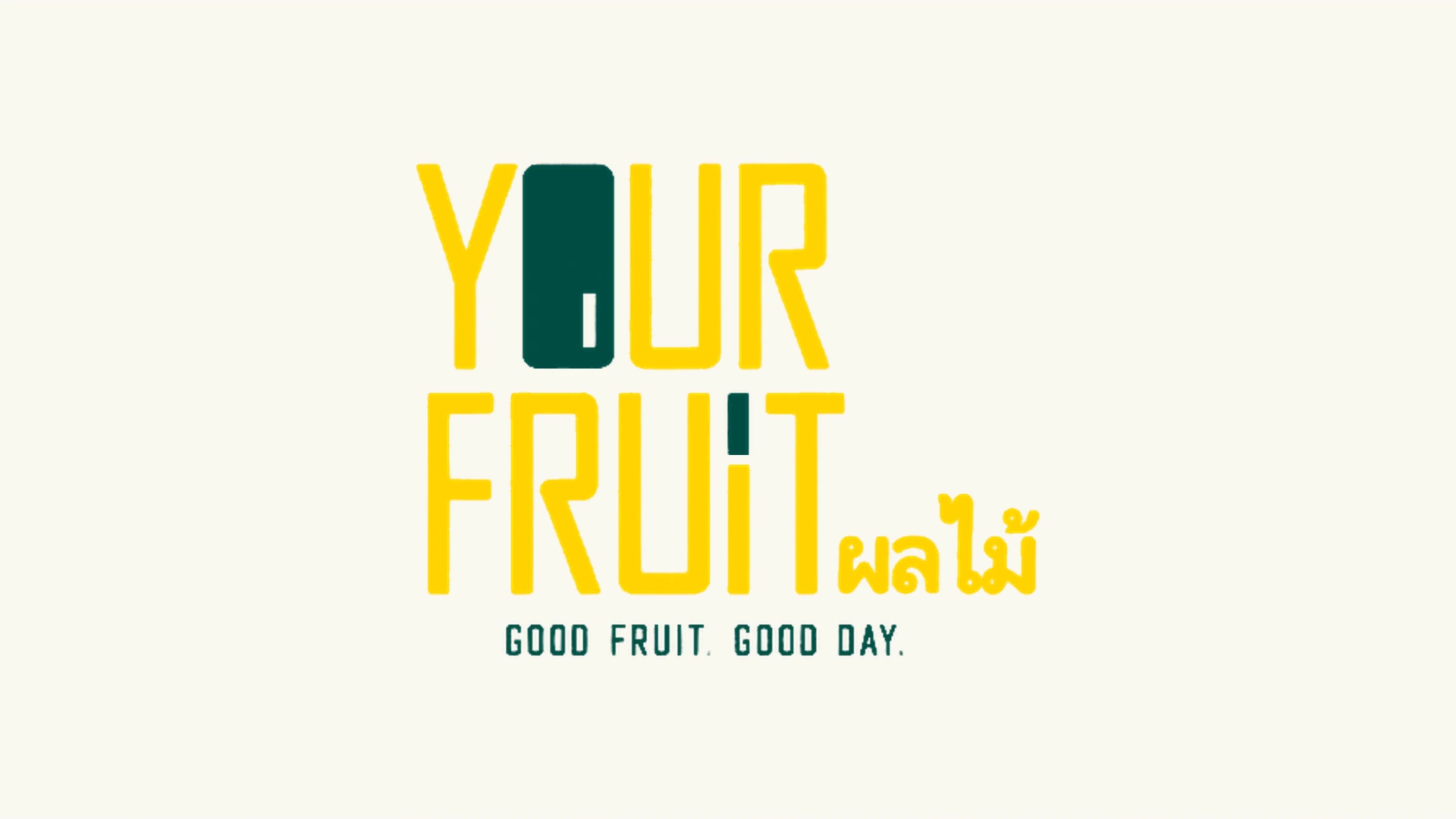
Your Fruit brings a clear graphic identity to the everyday fruit stall. Tall lettering, a solid green O and recognisable fruit shapes connect the English wordmark and Thai lettering with the colour and freshness of the produce.
01 / Identity system
One identity. Two languages.
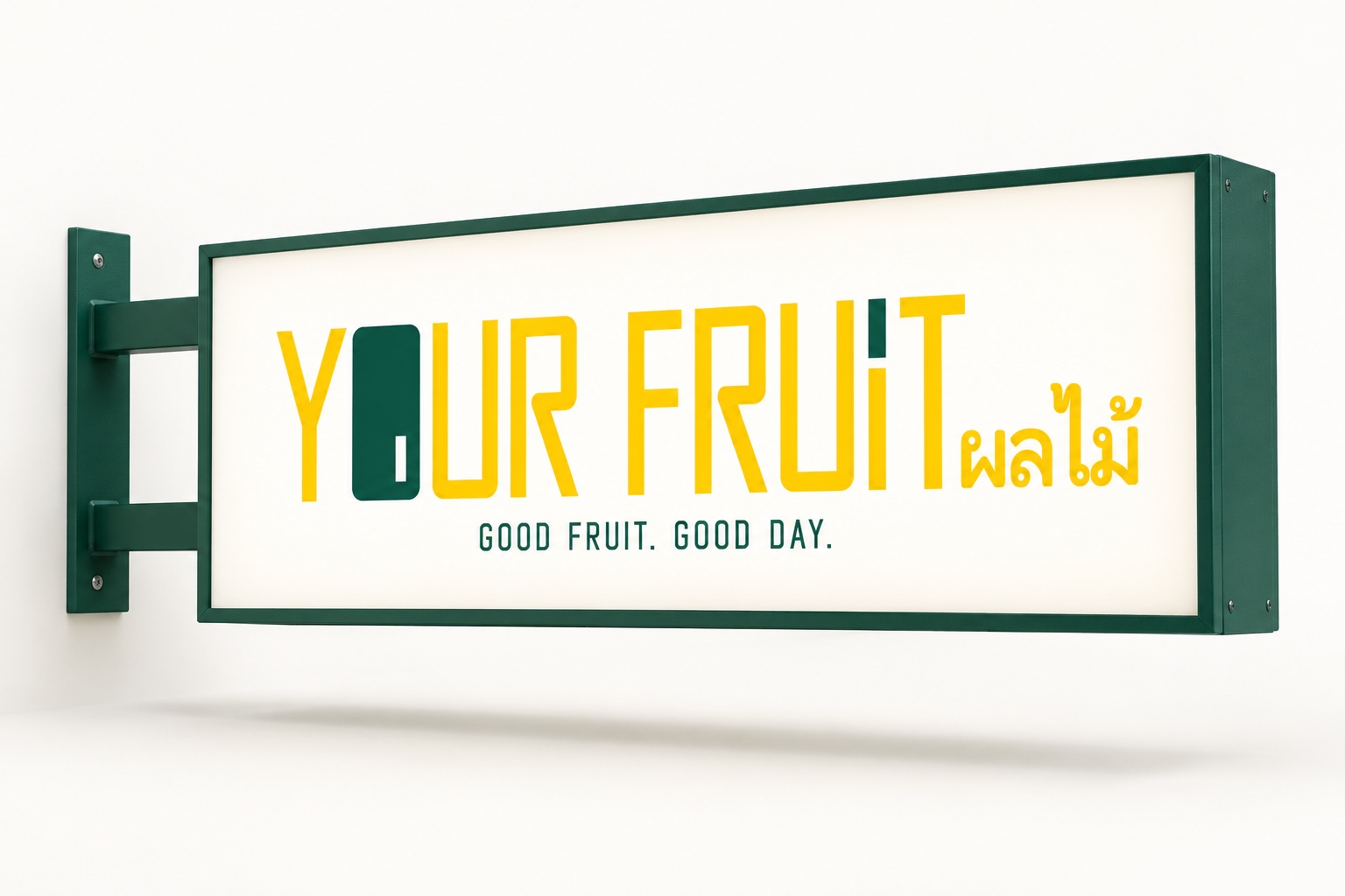
The stacked and horizontal logo arrangements share the same narrow letterforms. A solid green O and the green upper stroke of the I in FRUIT provide two points of contrast within the yellow wordmark. The Thai word ผลไม้, meaning fruit, completes the bilingual logo.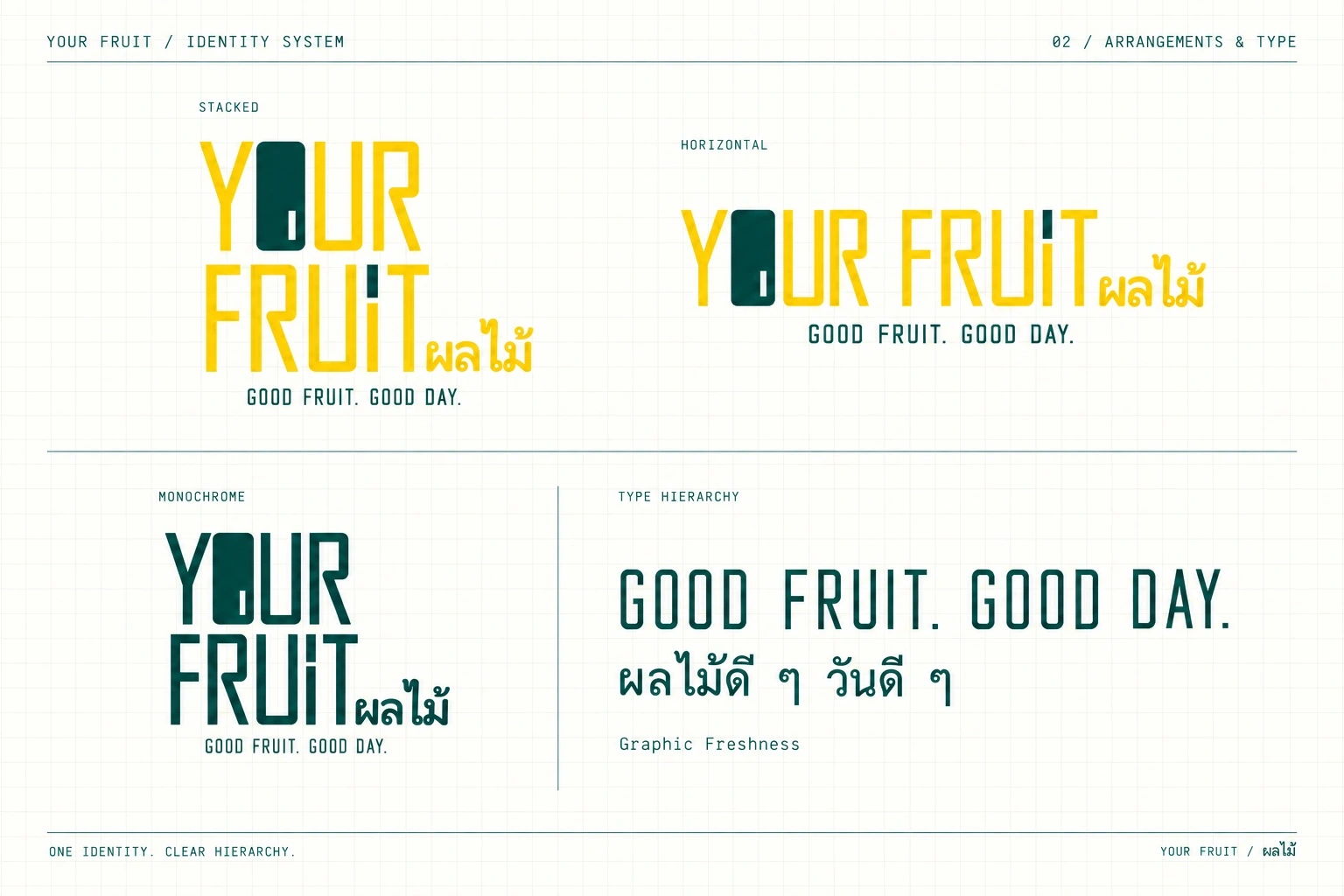
Slender lines. Solid accents.
Tall yellow strokes establish the rhythm of the wordmark. The solid green O provides a focal point, while a small rectangular opening at its lower right breaks up the dense form.
A vertical rectangular opening at the lower right echoes the upright strokes of the lettering and gives the O its distinctive detail.
The upper stroke of the I in FRUIT repeats the green, connecting the two rows through colour.
One identity. Clear hierarchy.
The wordmark, tagline and product information each have a distinct role. Narrow English lettering sits alongside legible Thai letterforms, giving both languages a clear hierarchy within one identity.
YOUR FRUIT / ผลไม้
Wordmark: use the approved stacked or horizontal English–Thai logo arrangement. Preserve the original letterforms, solid O and proportions; do not recreate it with a standard font.
GOOD FRUIT. GOOD DAY.
Tagline: narrow uppercase English with clear spacing, placed below the logo or used as a secondary message on objects.
ผลไม้ / แอปเปิล
Thai lettering: use legible letterforms for the Thai text in the logo and for fruit names. Allow room for marks above and below the letters, with clear alignment alongside English.
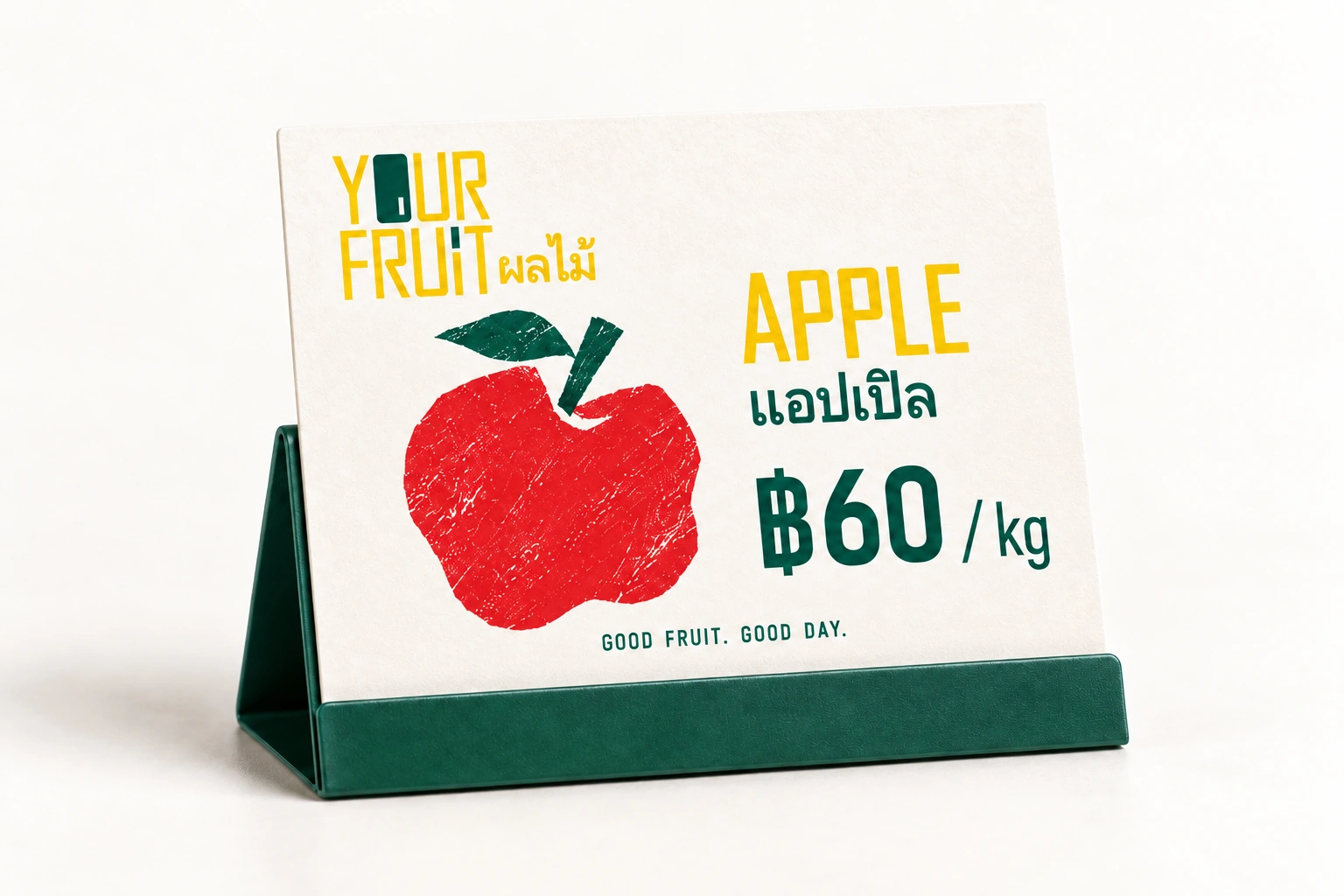
APPLE · ฿60 / kg
Product and price: use different type sizes for names, prices and units so prices are easy to read. Use handwritten lettering sparingly in supporting messages.
02 / Motion identity
Drawn in yellow. Grown in green.
Yellow strokes reveal the letters across both rows at the same time. The two green forms rise, bend gently and settle into place, bringing a plant-like gesture of growth to the logo.03 / Colour system
Bright colour. Room to breathe.
Sunny yellow and deep green lead the palette. Fruit red, sand beige and warm white support the fruit graphics, packaging and signs, keeping the colour relationships consistent across applications.HEX #FDD706
R 253 G 215 B 6
HEX #03574F
R 3 G 87 B 79
HEX #D55250
R 213 G 82 B 80
HEX #DAC5AA
R 218 G 197 B 170
HEX #FDFCF7
R 253 G 252 B 247
04 / 14 · COLOUR PALETTE
04 / Graphic language
Simple shapes. Big freshness.
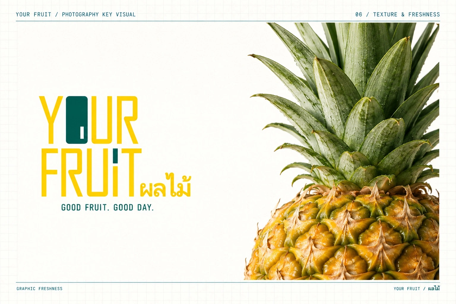
Pineapple, banana, mango, apple and watermelon become recognisable, irregular silhouettes with hand-cut edges and a dry-brush texture. Close-up photography complements the graphics with details of fruit skin, leaves and flesh.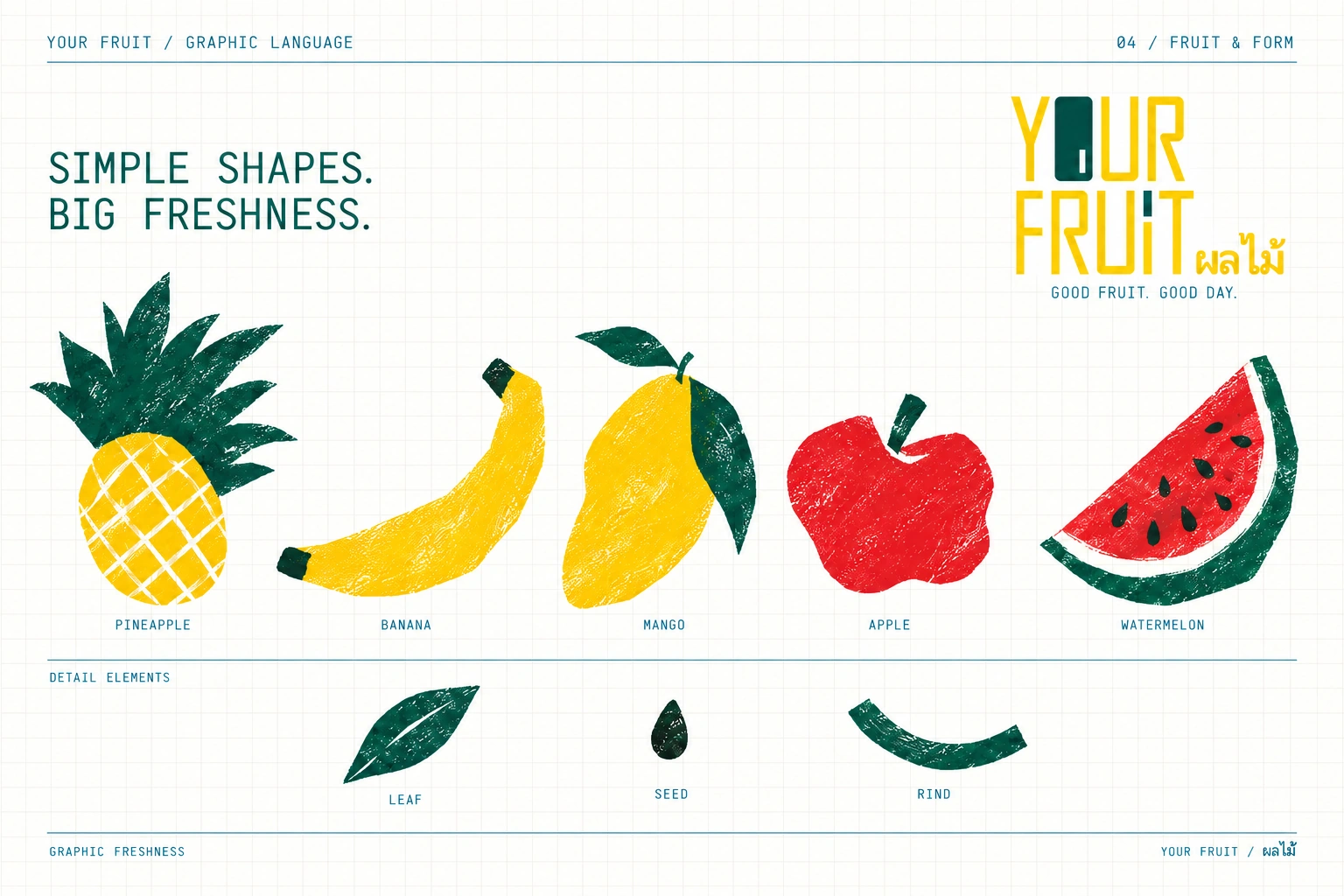
05 / Everyday objects
From the stall, into everyday life.
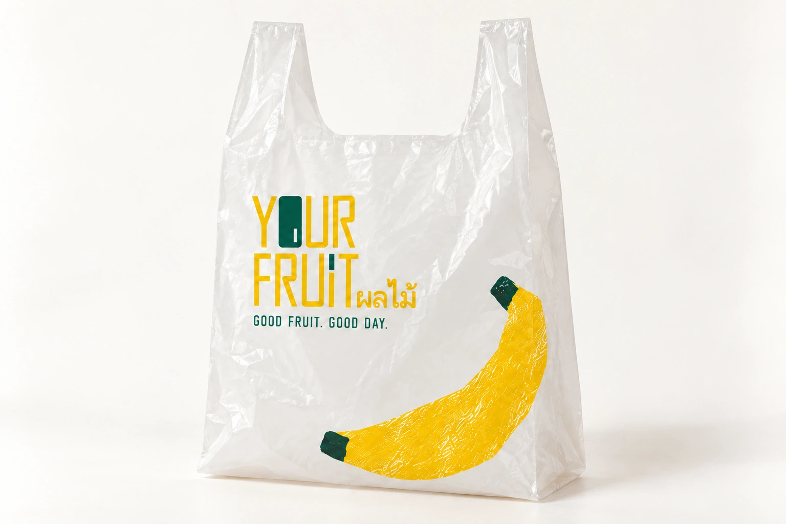
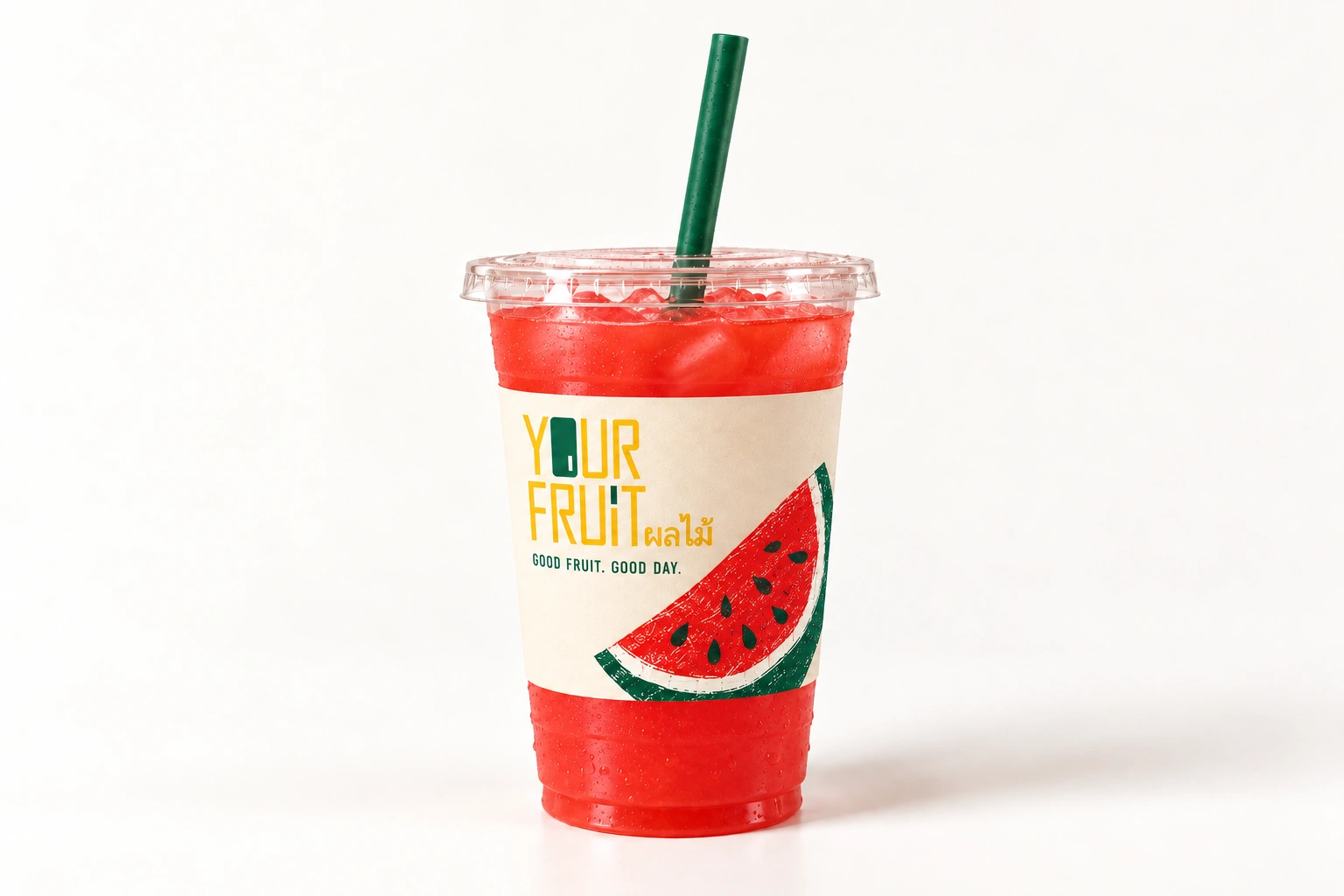
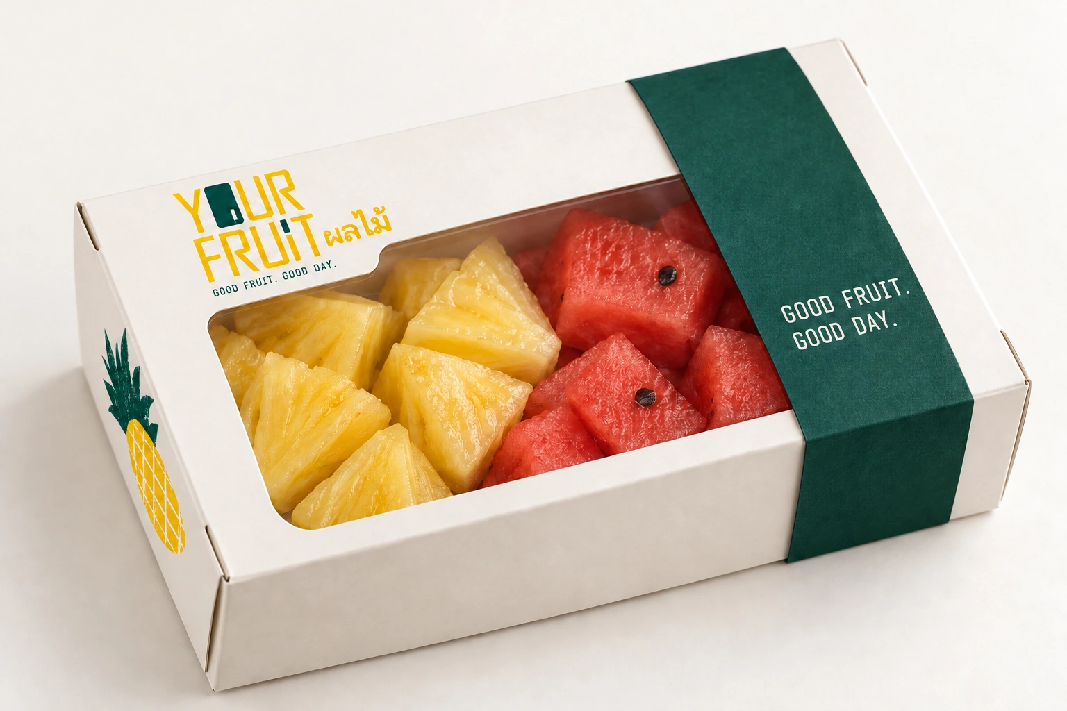
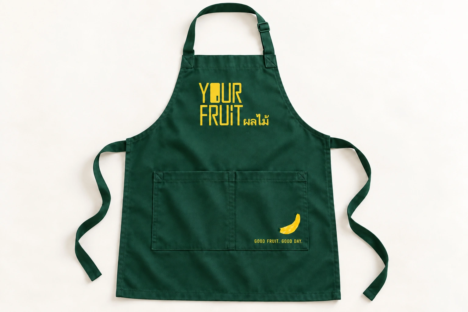
The identity extends to carrier bags, juice cups and takeaway boxes. Mango, banana, watermelon, pineapple and apple are distributed across the objects, connected by irregular silhouettes and a dry-brush texture. Brand names and essential information remain clear.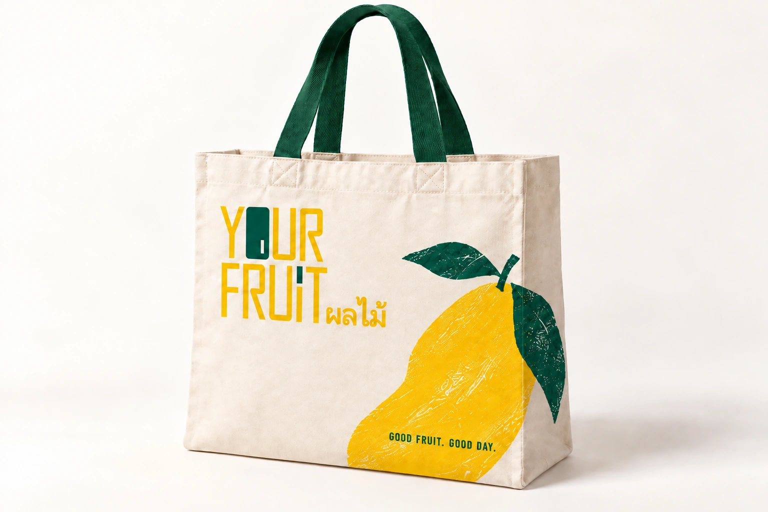
06 / Market setting
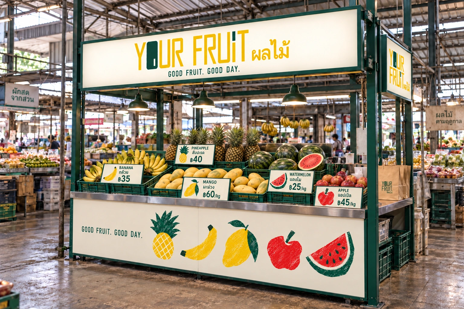
A place for good fruit.
The stall combines a deep-green steel frame, a stainless-steel worktop and removable fruit crates. Illustrated price cards identify each type of fruit, while the warm-white sign keeps the English and Thai lettering visible across the market.